


Process Work


How do I get started?
After receiving a project brief or creating one myself, I start to ideate. Sometimes I start with making a mind map or brainstorming a bullet list, other times I jump straight into making thumbnails.
This is an example from a recent piece I created for a college assignment during my senior year at SCAD. In the brief, we were asked to create an illustration of a god or monster of our choosing, and it must show off our subject and give a sense of place. It was a rather straightforward prompt.
I decided I wanted to make an illustration of the Loch Ness monster, or at least my imaginings of her. For a long time during my ideation, I was stuck between the idea of wanting to make the piece more sinister or more serene. After some in-class critique from both my peers and professor alike, I eventually landed on an idea.

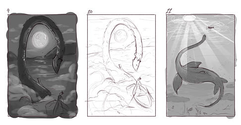
Refinement
After deciding on the idea I want to pursue, I go ahead and refine that thumbnail into a scaled sketch. Oftentimes, I pair this refined sketch with my black and white comp to test how I want the lighting and value to work for the piece and how I'll tackle it during my actual final.
For this piece, I knew I wanted to play with the way light interacted with the water and Nessie herself, and I especially knew I wanted to play around with the use of God rays of light. I had decided to go for the more childlike storybook composition and idea, so I wanted my values and coloring to reflect that as I develop the sketch further.

Coloring
Coming up with color comps is a more involved process for me. I love exploring the different ways I can color a piece and the different ways I can combine colors for different effects and feels. I knew at the most basic level that I wanted there to be a greenish hue across this piece, making the water feel more lake-like rather than sea-like.
I presented these different versions of the color to my peers, and we worked together to determine the best course of action, which turned out to be a more green-yellow color palette, while still maintaining some of the nice teal and turquoise hues.


The beginning of the end
After finalizing my plan for the piece, I can finally start on the final version. I jump around with what I work on, from line art to coloring, to shading, and rendering, I work on whatever my attention at the time tells me to work on. A lot of the time, the process is a lot more straightforward and step by step, but depending on the style I am working in and the mood I happen to be in, it can change the order around.
For a long while on this particular piece, I couldn't quite figure out if I wanted it to be lineless or not, so a lot of the lining actually came after most of the piece was finished, as I felt it gave more weight to the scene.
I was pretty happy with how it had turned out, but no project is ever truly done until you've had your final peer critique.
Final touches
With some very helpful critiques and suggestions, I made my final adjustments, added some fish, and deepened the contrast, and she's done!
I really love how it turned out, especially the color application on Nessie. I wanted to try a new method of color scrambling to give her form more depth and interest without being too odd in the color scheme. I think I did pretty well in the end, though there is always room for improvement in anything you do.
